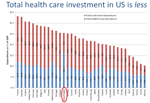
I expect many saw the recent report from Elizabeth Bradley at the Yale School of Public Health, The U.S. Health Care Paradox: How Spending More is Getting Us Less. If you haven’t seen it, take a look. It’s brief. The central point was in this graph:
When I saw it, I copied the graph for a post, but then got involved in something else and it got passed over for a while. Yesterday, I found it, and wanted to separate the pieces. I tried to do it graphically, but it was slow going, so I went looking for her data source. I’ve looked for where people get the figures on Healthcare spending before without much luck. But this time, I ended up on the OECD site – and found the mother lode for this kind of economic data. OECD stands for the Organization for Economic Cooperation and Development. And their statistical site, OECD.Stats is a cache for a data-hound to die for. Amazing amounts of world economic data awaiting free downloading [if you can figure out how to use it]. So, back to my quest, parsing that graph:
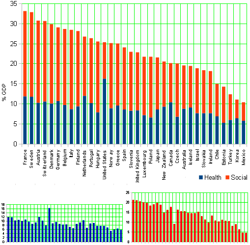
The graphs on the bottom are the elements [same order and relative scale as above]. It shows what I thought it would show. You could literally cut off the excess $ we spend on healthcare and fill the hole in our social spending. That’s Bradley’s point. We spend the most on health [without being the most healthy] and are in the basement on social spending. I expect we all knew that, but not the magnitude.
These numbers are all corrected and expressed as the percent of the Gross Domestic Product [GDP]. That’s how economists correct for the disparity of wealth in different countries. It’s a measurement the yearly generated treasure, and it’s available world-wide:

My take: we pay a lot to our profitable healthcare industry, but we’re a third world country in our social spending. Having arrived in the land of data, I thought I’d look at the time variable as well. So after some eye-crossing and downloading, I ended up with this graph:
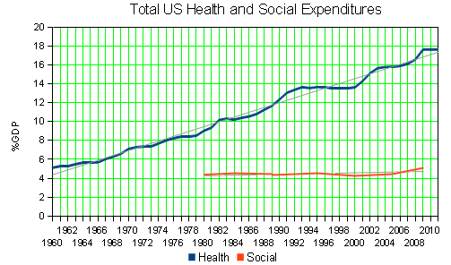
This is from two different databases in the OECD pantheon which obviously don’t exactly cover the same overall period and have different sampling rates, but combined, they add something to the story [remember these are corrected figures – % GDP]. First, Our overall Social spending is pretty close to level. I was surprised. For all the bruhaha over such things in Washington, it just kind of trucks along. I guess the point of our peculiarest of forms of government is that it allows us to swing back and forth on the front page, but dampens things out in the long run. We are on top of the heap and on the bottom at the same time. Living where I do, I really do see that every day, a poor rural county in the South that also has gated communities where immigrants from corporate America retire to play golf and be wealthy together in our beautiful mountains.
Your post brings up the interesting question of whether there is a “healthcare bubble” in the U.S., and if so, when it’ll pop. Just googling the term brings up some interesting results. One article has this tidbit which I think most of us will agree with:
Psycritic
Great point. It brought up so many thoughts that I expect it’ll be my next post. Thanks!
With an adequate safety net to allay the effects of poverty, prevent people (especially women and children) from being stuck in abusive situations with no affordable way out, to provide quality healthcare, to keep people off the streets, to give people enough options that they are less likely to be hopelessly dependent on exploitative employers, to provide education and consultation to help people develop more adequate life skills, and so on— how much of what is being diagnosed as “mental illness” right now would drop precipitously?
Wiley,
Eloquently said! And you’ve added to my list of future topics, but as a summary statement, I’ll never do better than you just did…
@wiley
That’s a good question. I wonder how mental health care factors into all this.
According to the NIMH statistics page, in 2006 about 57.5 billion dollars were spent on mental health services for 36.2 million people. “Within this group, 4.6 million children received mental health services totaling $8.9 billion”. (This information is from a survey called MEPS)
http://www.nimh.nih.gov/statistics/4COST_AM2006.shtml
—
In 2003, Mental Health expenditures made up about 6% of all health expenditures, about $100 billion.
http://www.nimh.nih.gov/statistics/4EXP2003.shtml
In 2003, about half of that $100 billion went to Hhospitals, orgaziations, and insurance admistration. The other half went to drug sales and doctors.
http://www.nimh.nih.gov/statistics/4DIS_SERVICE2003.shtml
Expenditure tracking for 1996-2006 seemed to imply the cost per person stayed roughly the same, but the number of people paying for mental health serices increased.
http://www.nimh.nih.gov/statistics/4MH_AM9603.shtml
From 1993 to 2006 the proportion of cost-per-person payments towards drugs as opposed to other services increased.
http://www.nimh.nih.gov/statistics/4CHANGE_PROV9303.shtml
Between 1996 to 2006 Mental illness and cancer expenses were roughly the same. As of 2006, mental illness expenses were the exactly as high as cancer. Mental illness was more expensive then Asthma.
http://www.nimh.nih.gov/statistics/4TOT_MC9606.shtml
The rest of the statistic are avaialble here:
http://www.nimh.nih.gov/statistics/index.shtml
Considering how outragiously expensive and without reasonable benefits over other available choices some cancer treatments can have (like this linked one), I’m pretty surpised.
http://online.wsj.com/article/SB10001424127887324296604578177802556030578.html
Only Heart Conditions and Trauma Related Disorders (head injury etc) are more expensive.
blush
High praise, indeed!
Movie Review of Inequality For All
http://www.washingtonpost.com/goingoutguide/movies/inequality-for-all-movie-review/2013/09/25/cd57aa10-214c-11e3-a358-1144dee636dd_story.html?wpisrc=nl_movies
http://www.alternet.org/economy/krugman-plutocrats-have-become-sociopaths-their-persecution-complexes