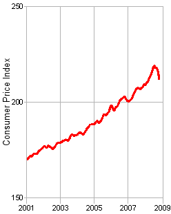
This graph of the Consumer Price Index is from my post in December 2008 [a few good republicans?…]. The worry then was a "Deflationary Spiral" [which is a very bad thing]. It’s when prices free-fall as panicky sellers hope to grab a dying market by dropping prices and portends sure doom. Here’s the graph now carried through February 2009:
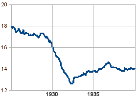
It’s not much yet, and it’s hardly sustained, but that little tick upwards at the end is comforting [and a hell of a lot better than the alternative]. Here, for comparison, is what happened between 1925 and 1940:
However, the Dow Jones Average corrected for Inflation [CPI] marches onward downward:
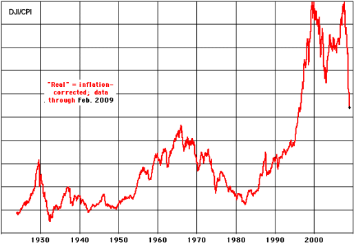
Which brings us to a particular conclusion:
From February 9th, 1966, through March 6th, 2009, the Dow Jones did not add any value at all, when adjusted for inflation:
Another, more optimistic estimate is that the Dow has gained about 1.64% a year, adjusted for inflation, from January 1924 through the present. However, even this optimistic estimate pales in comparison to historic bond yield rates… All of this makes you wonder why, as a nation, we have invested in the stock market as a means toward retirement via 401ks. It also makes you wonder about today’s news that forty-four million Americans could find their pensions wiped out by a decision at Pension Benefit Guaranty Corporation to shift from bond to stock investments last year.

Where is the boring old man?