-
 CPI [Consumer Price Index]: This index measures the cost of a fixed amount of goods at any point in time. So the Inflation Rate for a period of time is the percent change in the CPI over the interval.
 -
GDP [Gross Domestic Product]: This index measures the market value of all final goods and services made within the borders of the US in a year. It is often referred to as the Standard of Living.
-
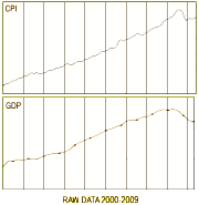
For example, the graph on the right shows the CPI and the GDP during the Bush Era – with the fall in the CPI [deflation] and the fall in GDP [production] in his last year.
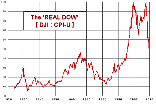
 While this approach makes logical sense, and the author of the web site where I got this graph has a really interesting discussion of the implications, if anything, the graph amplifies the escalation making the "why?" an even bigger dilemma. I’ve tended to assume that the boom economy of the 1990’s had to do with the Internet Bubble and the other bubbles that swept through our economy [with deregulation]. But, honestly, this "Real DOW" makes absolutely no sense to me. Instead of clearing things up, the mud just gets deeper.
Then I ran across this graph from an article by the Georgia Tech Financial Analysis Center, and it made me rethink the whole question.
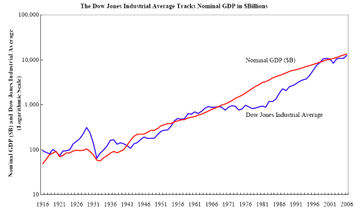
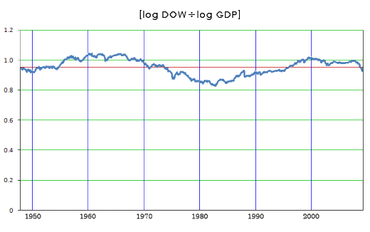
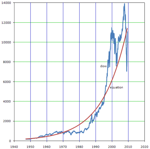
The point of the article was that the best indicator for the DOW is the GDP [not the CPI]. They’ve plotted these two parameters using a logarithmic scale [which turns things into something of a linear graph which is much easier to read]. Somehow, it makes intuitive sense to me that the value of the Market and the value of our Gross Domestic Product should track together. And when I look at that plot, the events around 1929 make good sense, the Market got way out of control. That’s what we’ve always been told. And when I look at the "flat" DOW from about 1963 until 1980, I have no idea of "why?" but what thereafter follows looks a lot like a gradual recovery from that period.
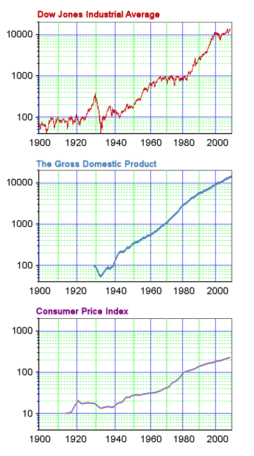
So, who cares if the DOW tracks the CPI or the GDP? I apparently do. It makes me feel like our economy is following some sensible rules, and is "on course." The new question, "What happened between 1963 and 1980 is more approachable that explaining that "Real DOW" graph. And the fact that the GDP and CPI have different slopes is intriguing, but is unlikely to be a cause for insomnia. Here are the logarithmic plots of the DOW, GDP, and CPI for those who find such things mildly interesting:
Sorry, the comment form is closed at this time.