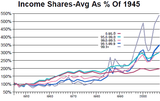
There are lots of different ways to slice up the economy to analyze it. But if you slice it fine enough to separate out the top 1% – and subdivisions with it, a funny thing happens: you discover that the economy since 1973 has done almost nothing for the bottom ninety-nine percent as an aggregate. [This data comes from Berkeley economist Emmanuel Saez, with a little extra parsing by me. I’m charting increases in average income for all income groups identified.]
Oh, sure, those in the top 5 or 10 percent excluding the top 1 percent have done okay… but not by historical standards. Those in 95th to 99th percentile have seen their incomes [including capital gains] rise by just over 50% since 1973, a period of 34 years [the last data is 2007]. But this compares to a 100% gain from 1945 to 1973 – a period of just 28 years. That’s roughly half the gain in 20% more years. And those in the 90th to 95th percentile have done substantially worse – just over a 30% gain since 1973 compared to 120% from 1945 to 1973, one quarter the growth over a period 20% longer.
What’s more, when you combine their incomes with everyone else below them, to get an average income for the bottom 99%, that average has only gained 10% over the past 34 years. Of course people in the 90th to the bottom of the 99th percentile don’t like to think of themselves mixed in with the rabble below. But the folks in the top 1% – particularly those in the top 0.1% must surely find this amusing, since the post-1973 economy really doesn’t work for anyone else but them. And the folks in the 90th through 99th percentile aren’t fooling anyone else but themselves if they think otherwise. Heck, even the bottom half of the top 1% only doubled their incomes from 1973 to 2007, the bottom 90% did almost that well from 1945 to 1973. This is the picture of an economy that’s stagnant for almost everyone – and has been for 34 years now, up until the biggest downturn since the Great Depression kicked into high gear one year ago…

[data through 2007 – my adaptation from Open Left]
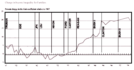
I’m used to showing this with the GINI Index…

but Paul’s data is more instructive. It not only shows the wealth inequity, it shows the associated income stagnation [except for the fabulously wealthy] Add to that that the Consumer Price Index [inflation] has risen from 42.6 to 215.8 [400+%] in the same interval.
So, the whole trickle down notion is something like warm piss running down one’s leg?
Wasn’t it John Kenneth Galbraith who said — I paraphrase — that trickle-down economics is the theory that if you feed the horse enough oats, then the sparrows in the roadway will be able to eat too ?
[…] But what of the taxpayers? Remember "trickle down economics" from the Reagan era? Somehow these massive tax cuts for the wealthy were supposed to help everyone because their prosperity would … well, it would just trickle down. These next graphs are the incomes of various groups of taxpayers over time [corrected for inflation to 2008 dollars]. The values are the mean Adjusted Gross Incomes of for the separated by their income percentiles. Notice that the people in the lower 99% of taxpayers have made little progress over the last 28 years. Only the top 1% have benefited. And that benefit is unchanged by taxes. That sounds like trickle up to me [or maybe tinkle on, to paraphrase Carl’s comment]. […]
[…] No wonder he is reverred by the wealthy. The top end wage earners doubled their take home pay under Reagan [30% tp 61.5%]. And as many of us have demonstrated, the wealthy have prospered greatly thereafter [unlike the rest of us who have stayed the same]. Remember "trickle down economics" from the Reagan era? Somehow these massive tax cuts for the wealthy were supposed to help everyone because their prosperity would … well, it would just trickle down. It looks more like money trickled up to me [or maybe we gpt tinkled on, to paraphrase Carl’s comment]. […]