I feel kind of powerless about what’s on the table right now.What do we do about our impossible situation in Afghanistan? What can we do about the current state of affairs in Congress? Will Health Care pass? Is Sarah Palin a media phenom or the harbinger of America’s Armageddon? Will Levi Johnston be naked in some magazine? Will Torture just fade or will the coming OPR Report, the New York Trials, something bring it into proper focus?
In the meantime, I’ve been nosing around our foreign trade and investment data because it has changed so dramatically in the post-Reagan era, and it looks like we’re on the short end of the stick After messing around with it, I ended up with an unexpected fact, but to be honest, I have no notion what it means. So here’s my fact
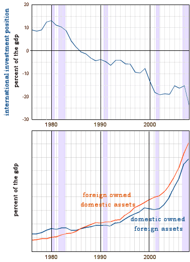
I was particularly confused about the
Net International Investment Position. It looks like foreign investors are "buying up" America [since about 1980 when
you-know-who got elected]. I looked up the
raw figures and things were a bit more complex than I originally thought.
It’s unclear why our foreign investments were so flat in the 1980’s, but the dip in our overseas buying around 2000 [the Internet Bubble] and recently [The Great Recession] make sense – while foreign investors just keep on buying. I started deconstructing the graph further, subtracting out the derivatives:
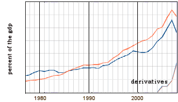
Which didn’t change much. The derivatives make up over a third of the assets. While it’s notable how quickly the "vapor-ware" derivitives got into our international economy, they seem to be going both ways. So I kept looking. The table I was looking at broke things down further – between privately owned assets and assets owned by governments.
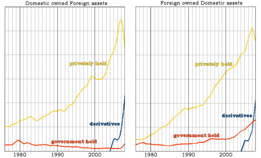
If you examine the privately held investments, our investment in foreign assets outpaced foreign investments here in every period except during Bush Jr.’s first term. That was the time of the Internet bubble and 9/11, but we rebounded and are again back ahead of foreign ownership of assets. But all of the declining
Net International Investment Position that I started with is from foreign governments purchasing assets in the U.S. That’s my fact. Foreign governments have invested heavily in U.S. Assets – things like U.S. Treasury Certificates – and they’re still at it. When I originally saw the NIIP graph, I had visions of oil sheiks buying our country. It never occurred to me that it was foreign governments. I wonder what it means? And what are the governments buying?
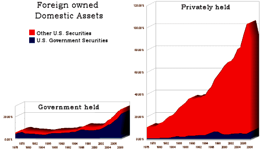
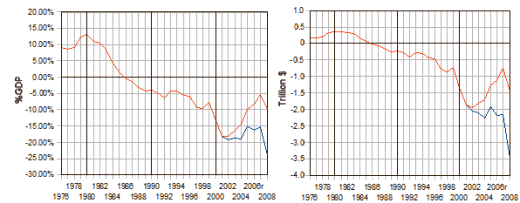
U.S. Treasury other U.S. Government Bonds, while the private foreign investors are buying Corporate Securities [I reckon that chasing this down is becoming my new hobby]. So, I wondered what would happen if I just zeroed out the increase in U.S. Government Bonds purchased by foreign governments after our wars started and recalculated the
Net International Investment Position? The blue line is the actual N.I.I.P. [expressed on the left as %GDP to correct for inflation and on the right as actual dollars]. The red line holds the foreign government investment at the 2002 level –
what might have been.
So what do you suppose? … guess that Mr. Bush financed his wars by printing U.S. Treasury Bonds and selling them to foreign governments?…
UPDATE: After I finished this research, I felt a bit like an idiot. While I knew the Bush Administration had financed their wars in a way that didn’t show, and I knew they’d done it by borrowing foreign money, It didn’t dawn on me that their little wars were directly [and totally] responsible for the extreme worsening of our foreign investment position. Looking at the graph on the right, it looks like a $2,000,000,000,000 enterprise [Wars + TARP]! That’s two trillion dollars!
[…] really grabbed me was something called the Net International Investment Position [NIIP]. What I found out was that almost all of our recently worsening position was from selling Treasuries to foreign […]