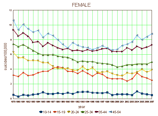
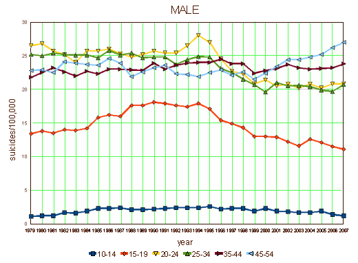
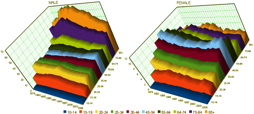
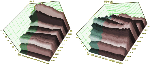
When I was looking around at the data in the last post [tortured numbers…], I ran into the CDC Compressed Mortality database for the first time. I stuck to the 1999 – 2007 version to reproduce the results in the NBER article I was reviewing, but I noticed that there was a second version from 1979 – 1998, so today I downloaded the suicide statistics by gender by age category because I was curious if the small window I’d been looking at was typical. I was surprised by the data, though I hadn’t much of a clue what a lot of it meant. I knew about the lethality of men and about the changes with age. But there are peaks and valleys in the timeline that I didn’t know would be there, differences between the sexes and age groups that were surprising [male and female y-axis scales are different]. I’m going to be out of pocket for the next three or four days, so I thought I’d just post the graphs and let you ponder along too [I stopped at age 54 because the rates fall and the image begins to look like spaghetti, so I added a 3D version of all ages below to show the late life gender differences]:


While they were unsuccessful in selling me that the SSRI warning had much effect on teens, they could have used the suicide statistics to argue that middle aged and elderly men and to a lesser extent women benefited from living in the age of SSRIs. Otherwise – nothing much:

The SSRI Era
Sorry, the comment form is closed at this time.