Turns out the Pentagon’s newly released numbers on civilian casualties in Iraq contradict the numbers Gen. Petraeus was hawking just last week.
Bringeth me my smelling salts …
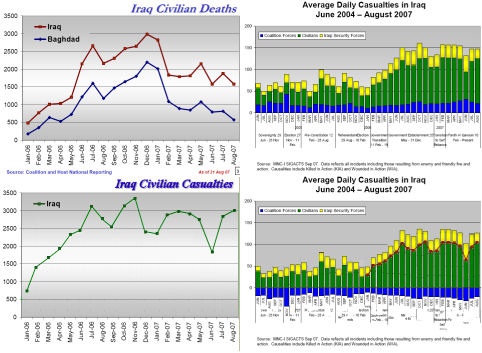
Intrigued, I followed Josh Marshall’s [TPM] link. There, I found a reference to General Petraeus’ slides [see Iraqi Civilian Deaths – upper left in the figure]. And I found a reference to today’s Quarterly Pentagon Report: Measuring Security and Stability in Iraq. The problem was that this report didn’t have a Iraqi Civilian Deaths graph to compare to Petraeus’ slide. But it did have Average Daily Casualties in Iraq [upper right in the figure]. Here lies the first lesson. Read the whole post first before you follow the links. After an hour of playing with the data, I followed theother TPM link to Democracy Arsenal where they’d already done what I was doing! But I will carry on, fully recognizing that original thoughts are rare in this universe.

The graph in the upper right is a little confusing. It’s casualties [killed in action + wounded in action]. It has U.S. Casualties [blue], Iraqi Civilian Casualties [green], and Iraqi Military Casualties[yellow] in a stacked bar graph. It’s in deaths/day instead of deaths/month. So I set out to get it into the same form as Petraeus’ graph. First, I moved each bar down so I could see the Iraqi Civilian Casualties and added a red line to the period Petraeus’ graph covered [lower right in the figure]. It didn’t parallel Petraeus’ graph to my surprise. So I converted it to the same scale [deaths/month] and put it on his same set of axes [same scale] [lower left in the figure]. By this time, I looked back and found that it had already been been done by Democracy Arsenal and felt kind of silly. But, undaunted I persist.
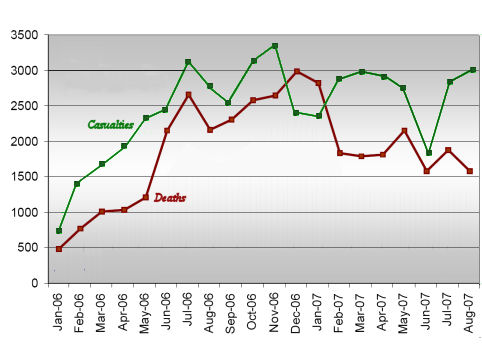
No matter who did it, it’s pretty interesting. This next graph shows Petraeus’ Iraqi Civilian Deaths in red with the Pentagon’s Iraqi Civilian Casualties superimposed in green.

From this graph, I conclude several things:
- 2006 was a disaster: Nobody ever told it straight, but 2006 was a disaster in Iraq. Both graphs show a three to five fold increase in the death and casualty rates over the course of the year. The U.S. deaths didn’t change too much, but the Iraqi Civilians took a hell of a hit! Petraeus’ graph says ~ 22,000 Iraqis died in the year and some estimates are a good deal higher. This is a "bloody" Civil War!
- No wonder he didn’t show the Casualty Graph: If you look at the Casualty graph, you sure wouldn’t say that the Surge made any difference. The most you could say is, "We had a good June." or "We stopped things from getting worse." But never would you say, "The Surge is working."
-
There’s something very wrong with these numbers: If Casualties = Killed + Wounded like it says. In December 2006 and January 2007, there were more Deaths than Casualties. In other words, Killed + Wounded < Wounded. That’s obviously impossible. Here’s what Ilan Goldenberg at Democracy Arsenal had to say about that:Anomaly A: Somehow in December, the month that is always cited by the Pentagon and the Administration, Petraeus’s Iraqi dead is actually greater than the MNC-I Iraqi Dead + Wounded. That makes absolutely no sense. You can’t have more dead than dead and wounded combined.Anomaly B: In the months after the surge begins Petraeus’s Iraqi dead numbers are significantly lower than the dead + wounded numbers in the Pentagon report. This is inconsistent with the entire history of the previous year, where the numbers track closely. The only explanation would be a dramatic increase in the wounded to dead ratio. Perhaps there were more car bombings that injured people but didn’t kill them, as opposed to close range executions where victims do not survive. Or maybe there is another explanation. Still it seems inconsistent to see this major split just as the surge begins..
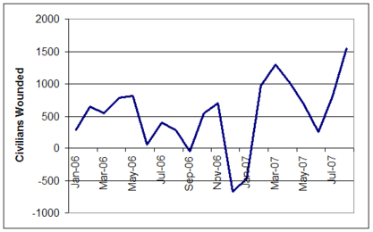
 I’ve also graphed what the wounded numbers should look like based on this data (i.e. you can take the total civilian casualty numbers and subtract civilian deaths to find wounded). Notice how in December 2006 and January 2007 the numbers are actually negative, which makes no sense at all. By far the three highest months of wounded are March 2007, April 2007 and August 2007 – after the surge has started.I would go further. I would say that these discrepencies say that there’s been a lot of massaging of numbers, at the least picking and choosing. We all know it’s true, but this kind of proves it to me in a very "graphic" way. Move.On is right! Petraeus has "cooked the books." The only other explanation is that the Surge made Iraqis less vulnerable to death when shot or blown up – hardly a viable hypothesis.
 -
I question the motive for the Surge: I find myself wondering if the real motive of the Surge was to keep things from going to hell in a handbasket. In 2006, this thing was going straight into the toilet. Was the Surge a way of cooling Iraq down so we could stay, instead of being overwhelmed by a deteriorating situation?
More than ever this is a lose/lose situation. We pull out and there is an even larger humanitarian crisis and civil war killing heaven only knows how many that we helped start. We are the big bad guys who started it and left. We stay and the number reflected in the charts don’t change including American casualties. We lose. Either way we lose.
And yes, no matter how much it pisses off Dick Cheney, Moveon.org is right.