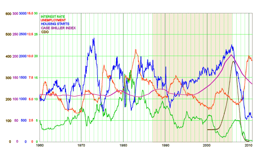
Last week when I was obsessing about Greenspan, you might have noticed that in mid-stream, my graphs started looking different. The one I called a "spaghetti graph" disappeared and was replaced by ones that looked like the one immediately below this paragraph. It’s a graphic wonder that has "layers" for each parameter that can be turned off and on. My reason for doing that was that I could see just the part I was focusing on at a given time. Here’s what it looks like when all the layers are turned on:

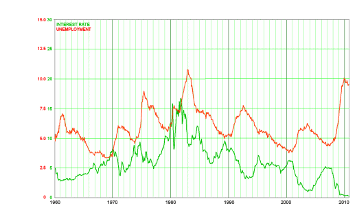
There’s a piece in here that didn’t make any sense to me. That period around 1980 looks like a rat’s nest, a dust bunny, some kind of a mess. So I isolated the parts that looked like they were the main contributors to the mess [below]:

It’s a period we all remember. Mortgage Rates went through the roof. On the other hand, we were all pouring our money into the "money market" to get CD’s [Certificate of Deposit] at really delicious Interest Rates. What was that all about? Maybe you know, but I didn’t. It was the 1980’s and I was working, teaching, and in Psychoanalytic Training. I expect that I spent exactly zero time attending to the American economy in those years.
Two things. First, I learned by looking into Greenspan’s time in grade that the Chairman of the Federal Reserve is the most important figure in America’s economy, not the President. Second, I learned that all that activity had to do with runaway Inflation.
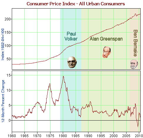
Inflation is the gradual decrease in the dollar value of money. It’s why we call money "currency" – eg the current value. Were there no inflation, people would put their money in coffee cans under the matress, out of circulation, and the economy would flounder. Capitalism requires that money be always moving. On the other hand, too rapid inflation is a disaster – you can never "keep up." And deflation is worse because manufacturers can make no profit so they grind to a halt as people make things worse by dumping their inventory. Inflation is needs to be "just right." It’s measured by the CPI-U [Consumer Price Index – Urban], and as you can see on the upper graph, it’s hard to visualize. The bottom graph is the % change since "this lime last year," which makes it apparent. Inflation became a problem in the late 1960’s, and by the late 1970’s was the out of hand nightmare handed to Paul Volker when he became Chairman of the Federal Reserve in 1975.

If you don’t yet know where I’m going here, here’s the punch lines. First, what happened back then has something to do with the Greenspan Era I just talked about. Second, it’s going to require a few more layers on my spaghetti graph to bring any clarity to what happened.
[…] Boring Old Man « nothing free about it… fifty years at the […]
How come they call it “the dismal science”?