Alchemy, Magi, & déjà vu
 This post can be skipped by the weak of heart, the mathematically challenged, or anyone who can sign commitment papers on the State of Georgia.
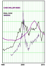
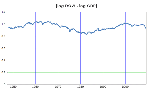
I’ve been troubled by something simple on all of these graphs. It’s very hard for me to look at the DOW JONES Average as anything but the sum of the dotcom bubble and the housing bubble. That’s just the way it looks to me. In fact, that’s what it is. The thing that bothers me is that it’s too high now, or it seems too high. I worry that there’s something artificial keeping it where it is. And after several decades of Market manipulation creating illusions, I worry that the Alchemists and Magicians of Wall Street are doing another number on us – a bit of uncharacteristic paranoia on my part. But then I got this uncanny feeling that I’ve been here before. It turns out that I had the same worry almost a year ago as well. And when I looked back at that post, I concluded that my fear was unwarranted. It’s an illusion created by how I corrected for inflation [CPI-U instead of GDP]. Here, for those of you with strong constitutions, is what I found last year. We are where we’re supposed to be…
|
Many people try to correct for inflation using one of the economic indices available from the BEA [Bureau of Economic Analysis] or the BLS [Bureau of Labor Statistics] Internet sites. The two most used indices are the CPI [Consumer Price Index] and the GDP [Gross Domestic Product].
Now to my point. Looking at the DOW Jones Average [above right], there’s an apparent escalation in late Reagan/Bush, accelerating in Clinton. That escalation has been open to all kinds of interpretations/implications. But then there’s the question of how to look at the DOW in relationship to Inflation. One simple way to think about it is to correct the DOW using the CPI. After all, the CPI is how inflation is measured. The resulting graph is called "The Real DOW"[adapted below]:
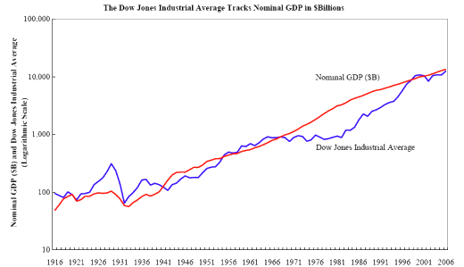
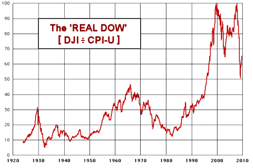 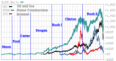 While this approach makes logical sense, and the author of the web site where I got this graph has a really interesting discussion of the implications, if anything, the graph amplifies the escalation making the "why?" an even bigger dilemma. I’ve tended to assume that the boom economy of the 1990’s had to do with the Internet Bubble and the other bubbles that swept through our economy [with deregulation]. But, honestly, this "Real DOW" makes absolutely no sense to me. Instead of clearing things up, the mud just gets deeper. While this approach makes logical sense, and the author of the web site where I got this graph has a really interesting discussion of the implications, if anything, the graph amplifies the escalation making the "why?" an even bigger dilemma. I’ve tended to assume that the boom economy of the 1990’s had to do with the Internet Bubble and the other bubbles that swept through our economy [with deregulation]. But, honestly, this "Real DOW" makes absolutely no sense to me. Instead of clearing things up, the mud just gets deeper. Then I ran across this graph from an article by the Georgia Tech Financial Analysis Center, and it made me rethink the whole question. The point of the article was that the best indicator for the DOW is the GDP [not the CPI]. They’ve plotted these two parameters using a logarithmic scale [which turns things into something of a linear graph which is much easier to read]. Somehow, it makes intuitive sense to me that the value of the Market and the value of our Gross Domestic Product should track together. And when I look at that plot, the events around 1929 make good sense, the Market got way out of control. That’s what we’ve always been told. And when I look at the "flat" DOW from about 1963 until 1980, I have no idea of "why?" but what thereafter follows looks a lot like a gradual recovery from that period. So, who cares if the DOW tracks the CPI or the GDP? I apparently do. It makes me feel like our economy is following some sensible rules, and is "on course." The new question, "What happened between 1963 and 1980 is more approachable that explaining that "Real DOW" graph. And the fact that the GDP and CPI have different slopes is intriguing, but is unlikely to be a cause for insomnia. Here are the logarithmic plots of the DOW, GDP, and CPI for those who find such things mildly interesting: 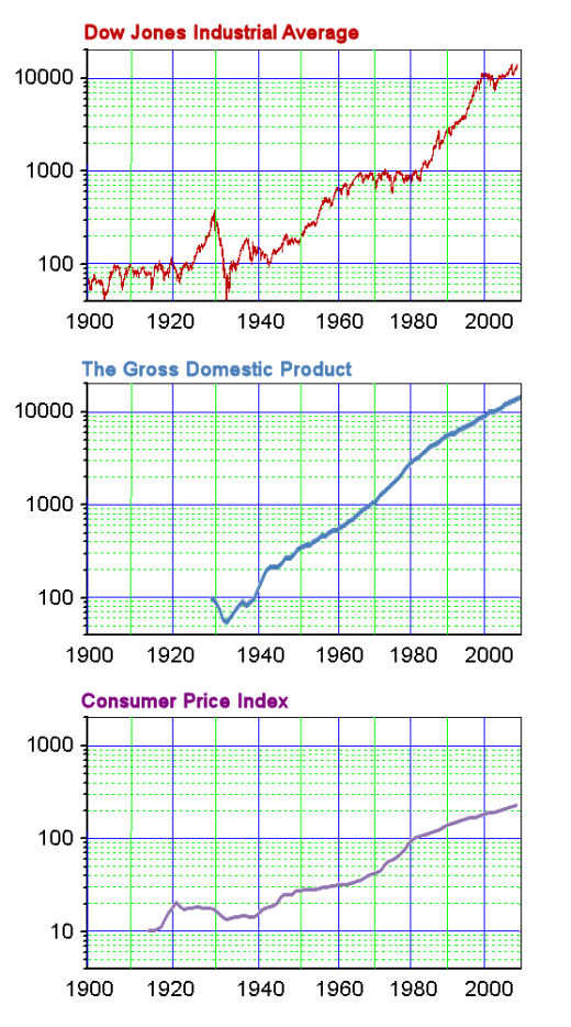 UPDATE: Well, of course I had to check it out by downloading the DOW and GDP values and graphing the (log DOW)/(log GDP). They look like parallel lines to me. I call it the 1DGMI [1boringoldman DOW GDP Macroeconomic Index]. What does it mean? Who knows? Except that the DOW and GDP are logarithmic and parallel and that we seem to be close to where we’re supposed to be…
 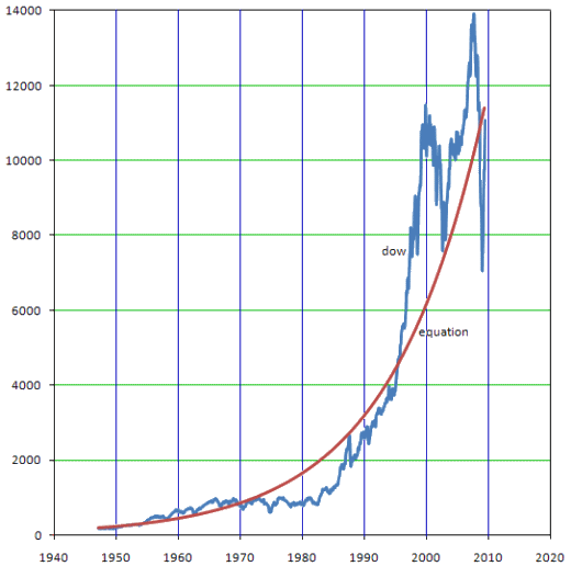 The DOW compared to the equation
|
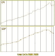 CPI [Consumer Price Index]: This index measures the cost of a fixed amount of goods at any point in time. So the Inflation Rate for a period of time is the percent change in the CPI over the interval.
Sorry, the comment form is closed at this time.