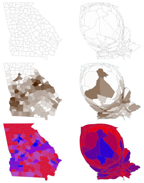
The upper left picture is Georgia, with all of its 159 Counties. The upper right is a Cartogram, the picture has been distorted to show each county’s area as a function of its voting population. As you can see, Georgia’s population is overwhelmingly weighted to the Metro Atlanta area – sparsely populated in the north and mildly populated in the south and southeast.
The middle two pictures are the racial distribution in the State. With the exception of Atlanta proper, the northern third of the State is white. The "black belt" runs diagonally from Augusta on the east through Macon and on to Columbus. In the Southern part of the State, the racial lines are less distinct. The Racial Cartogram shows that the racial make-up of the Metro Area is predominantly black in Fulton and Dekalb Counties, surrounded by "the doughnut," the mostly white suburbs – a pattern established in the "white flight" era of the Civil Rights Movement.
On the bottom is Tuesday’s Senate run-off vote showing Martin’s support in the City of Atlanta [doing fair in other cities] and the "black belt" – with Chambliss capturing "the doughnut" and most of rural Georgia.

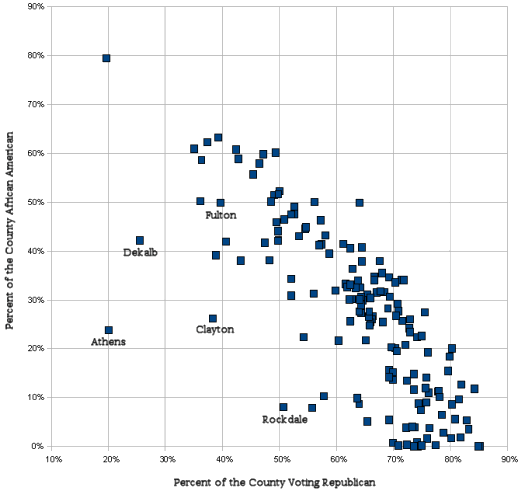
There were no exit polls so the exact racial makeup of the turnout isn’t available. This graph compares the % of African Americans that live in a County to the % in that County voting Republican. As you can see, race remains a very strong predictor in Georgia. The exceptions are a few Metro Counties and Athens [University of Georgia].
Fascinating, but it doesn’t mitigate my funk. I suppose this is the time to parse a word like “hope” to see whether it requires any link to reality or whether it only alters course in the face of events that would strip stubborn from the list of possible adjectives. Jim’s concession speech said that the good news for Democrats was that we won the Presidency, and that does make a huge difference. In fact, after living in Hyde Park in Chicago, Obama’s election defies everything I thought I knew. So maybe there’s a glimmer of hope for Georgia?.