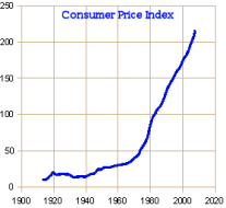
 or to divide it by something else – some other average. The most rational version I found is to divide the Dow Jones Industrial Average by the Consumer Price Index. Like the DJIA which averages the price of certain stocks, the CPI-U is how much consumers pay for a representative basket of goods and services.
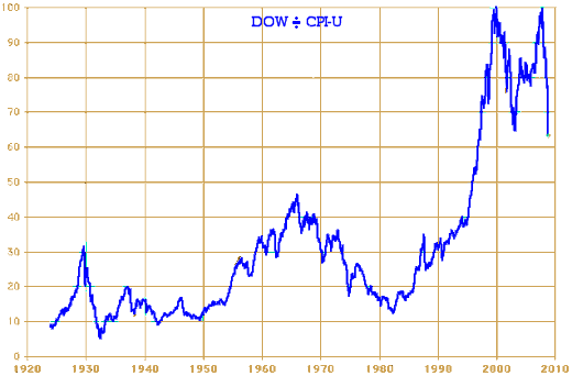
 So the Index from DJIA/CPI-U is the comparative buying power of the Stock Market assuming each of these indexes is a stable measure over time. The CPI-U is widely held to represent the actual real value of our currency [a wonderful word, currency – the value that is current].

[There is an explanation of this graph here and a more extensive analysis at iTulip]
I like it! It makes sense to me because it shows what everything else would indicate it ought to show. It documents my experience of the 1950’s, the post War economy that created the suburbs I grew up in, rock and roll, and a relaxed stable economy [never mind that there was the constant fear of thermonuclear holocaust]. Then things headed downward during the Viet Nam War and the tumultuous sixties and early seventies [when Nixon floated the dollar to pay for the war]. I don’t know what I think about the upturn in the early 1980’s. Reagan was messing with things a lot – running up the national debt like it was a credit card, spending big on the military, deregulating the Banks, etc. There’s even a blip in 1987 where the Market tried to soar, but was corrected by the 1987 crash·let. So I’ll pass on the years between 1980 and 1995. I think there are lots of smoke and mirrors there, but I’ll leave that for the experts. But I’ve got something to say about the graph from 1995 to the present. Around 1995+, we fell in love with techno-anything:

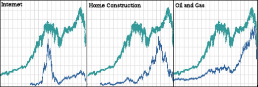
techno-bubbles on parade…
From left to right: Technology, Telecommunications, Mobile Communications, Internet, Computer Hardware. It was a bubble, as they say [bigger that just the DOT.COM’s]. But it was also a technology market that picked up with sustained growth after the bubble[s] burst. However it sure doesn’t account for the Stock Market’s continued high performance. But we know about that now. There’s the HOUSING bubble rising as the technology bubble burst. And after the HOUSING bubble burst, we still had the OIL bubble soaring until mid-June of this year. Bubbles upon bubbles, helped along by Greenspan’s playing with interest rates, the antics of the Bankers, and the side bets on the unregulated Credit Default Swap Markets – AKA The Casino. Bubbles and gamblers add no real value to the Market. They just move wealth from losers to winners – falsely inflating the Market in the process.

the march of the bubbles…
In my last post, I was using Alan Greenspans phrase [Irrational Exuberance] and Robert Shiller’s musings about it as a straw man. Robert Shiller, in particular, has been an absolute prophet of the truth. But what is irrational on that graph is bigger than just "irrational exuberance" on the upside of a specific bubble. The whole graph from at least 1995 on is irrational. There is no way in hell that the value of the American Stock Market is 2½ times greater in 2008 than it was in 1995, nor is it 7 times greater than it was in 1980. That’s what’s irrational! It’s so irrational that is reaches the level of Delusion [a fixed false belief].
 What is the Market’s true value? I don’t know. The guy that drew that graph and iTulip have some ideas based on a mathematical model that seems rational, but I’ll leave that for your own exploration. All I came to say was that we’ve been living an irrational dream for a long time. Why didn’t we see that? For my part, it was because I didn’t look. I guess I thought somebody else was looking for me. Or maybe I just didn’t want to see the truth any more than almost everyone else. The whole Stock Market is a 1929-like bubble. That’s the way it looks to me now. In spite of Bush’s and McCain’s reassurances that the fundamentals of the economy are sound, the fundamentals of the economy have been dismal for a while. Our current task is to make a better recovery than Hoover made between the collapse in 1929 when it fell and the bottom three years later [when F.D.R. finally attacked things with a vengeance]…
Sorry, the comment form is closed at this time.