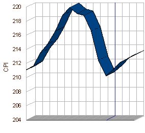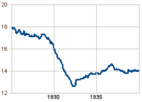
This is the graph of the Consumer Price Index for all of 2008 through 2009 to date. It is a picture of a bullet being dodged. While it’s not the index we follow to see if the Recession is lessening, it is the index we follow to make sure we’re not flying off of a cliff. The poison in a Recession is the Deflationary Spiral. It’s the situation where people panic and drop prices dramatically. Paradoxically, our money suddenly is worth more than it used to be. Unfortunately, the deflation becomes self perpetuating. A slow inflation which we find annoying turns out to be a good thing after all. Here it is again from the Great Depression:

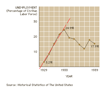
Looking at the top graph, we flirted with a deflationary spiral in the 3rd and 4th quarters last year, but we seem to be back on track. It doesn’t tell us about recovery, it only tells us that the black hole of a Depression is averted for the moment. There’s another grim reminder on the lower graph. Note the dip and levelling in 1937. That’s when F.D.R. let up on his New Deal prematurely in response to his critics, and prolonged our misery until WWII. It’s more apparent on the unemployment graph:

Recovery is fragile…
Sorry, the comment form is closed at this time.