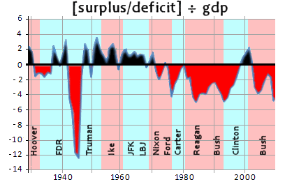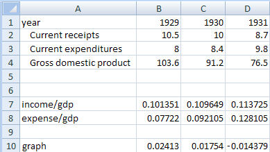
 I’ve gotten a couple of comments about my obsession with graphs ["They’re too hard to figure out."]. So I’m going to narrate this one, because it’s important as it sits in opposition to the biggest Republican lie of all. The data comes from the Treasury Department and the Bureau of Economic Analysis. line 2 and line 3 are the country’s income and expenses by year. line 4 is the Gross Domestic Product [used to correct for inflation]. The corrected values are shown as a percent of the GDP. line 10 is line 7 minus line 8, the deficit or surplus for the year.
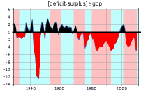
 The inset on the left is a colored in version of the graph – in the red and in the black. So in the early years of the graph, both Hoover and FDR used deficit spending to combat the Depression. Then there was the massive debt from World War II. The modern deficit spending started with Nixon and Ford. In 1976, Carter‘s Administration reversed the trend, but never made it into the range of surplus. The routine deficit spending started with Reagan and GHW Bush. Again, Clinton‘s Administration reversed the trend. It took into his second term to balance the budget and begin to pay back our debt. GWBush [Cheney] immediately returned us to deficit spending, persisting throughout that Administration and exiting with a real bang with their Bank Bailout.
Sorry, the comment form is closed at this time.