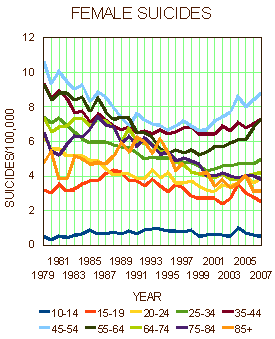
After the second email about the female suicide statistics, I gave in to the temptation and parsed out the age groups so they could be seen more clearly. First, the spaghetti, then the deconstructed version:


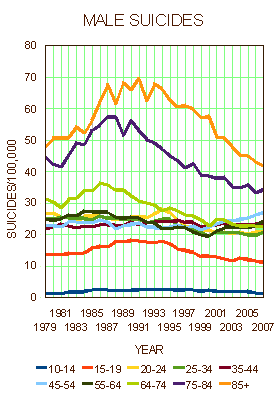
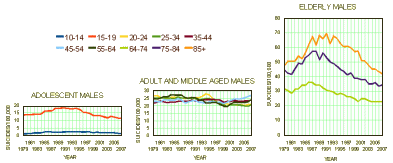
Here, for comparison, are the men [again note the y-axis scale differences between men and women]:


I don’t know what has cut the elderly suicide rate almost in half in both men and women, but the intriguing timeline to me is the adult and middle-aged women. Whatever the case, there’s the data laid out for pondering or some graduate student in search of a topic…
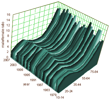
However, the male/female ratio looks constant over time, so my question of a difference seems to evaporate. It was a scale artifact I suppose…

Sorry, the comment form is closed at this time.