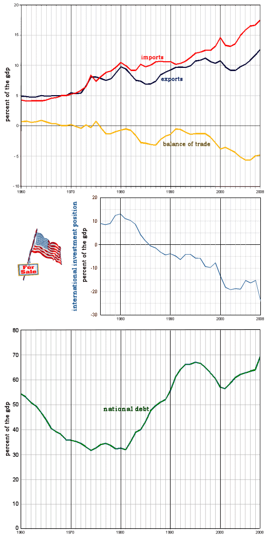
Well, here are some more graphs from the BEA [Bureau of Economic Analysis]. All are corrected against the GDP [Gross Domestic Product]. The top is the Balance of Trade [Exports – Imports]. The middle one is the NIIP [Net International Investment Position = domestically owned foreign assets – foreign owned domestic assets]. And the bottom graph is the National Debt.
It looks to me like something happened around 1980 that lasted into the early 1990s, but then improved for a while – worsening again about 2000 and thereafter. I wonder what it was?
Sorry, the comment form is closed at this time.