
It isn’t over ’til it’s over, but it looks to me as if unemployment is falling as "usual" in a recession recovery. President Obama’s first year has been a lightening rod year. The Republican’s screamed that the Stimulus Bill was Socialism [way too high]. The Economists screamed that it was way too low [Krugman said 50%]. From the looks of things, to me it seems like it was "way just right."
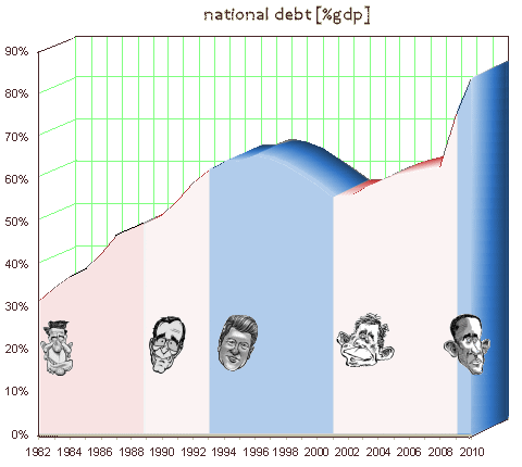
Then there’s the resulting National Debt, now the focus of the Republicans, the Teabaggers, the Talk Radio guys, Fox News, and to a lesser extent, the rest of us. And it’s impressive [displayed here in the usual way – as a percentage of the Gross Domestic Product]. I took a course in medical school about the use of statistics in scientific work. Part of it was about learning how to identify graphs and tables that show data in a better than it ought to look way. One way is to use indexes [something divided by something else].
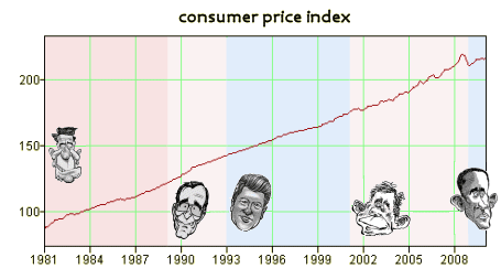
While expressing the National Debt as a percentage of the GDP seems to have a meaning – "how much of our country’s productivity is tied up in the debt," if you think about it, they are actually independent variables. The real reason the index is used is to "normalize" the debt to contemporary dollars. Another way to do it would be to use the CPI [Consumer Price Index], but there are other reasons they don’t do that that I don’t get, and anyway, it’s got a spurious ‘wiggle’ too. So back to the (National Debt)/(GDP).
Here’s the graph of the GDP over the same period. It’s a smooth very gradual curve except since September 2008. The only other time it has fallen like this was in 1929 with the Great Depression. That’s why many call this the Great Recession, since both the GDP and the CPI fell, suggesting we were entering a deflationary spiral, the route to a Depression. But that messes up our index – (National Debt)/(GDP) – because this loop-da-loop in the GDP does not reflect a change in the value of money. It says something else.
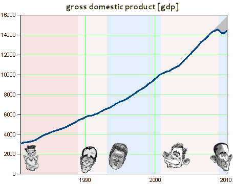
So I wondered what would happen if I extrapolated the GDP curve based on its history to more reflect the value of money and recalculated the National Debt curve. The results [before and after extrapolating] are shown below.

Admittedly, the jury-rigged graph on the right looks a lot more like I’d like for it to look. For that reason, I sure don’t plan to do a Power Point presentation at the local Teabagger rally with my revised graph ["See. There you guys go again. Playing around with numbers, trying to make your boy look good!"]. But I do honestly think it’s a more accurate reflection of what’s happened in these last eighteen months [since Lehman Brothers and everything else turned upside down]. It’s intuitively more correct – more like things feel. It’s also more manageable. And so I’m thinking Obama is genuinely looking good by my reckoning. In spite of all the incendiary rhetoric, President Obama’s compass is still pretty much "way just right". I’m impressed…
[…] people with more skill than I. I’m limited to looking back at what happened this time [way just right…, the parade of my old wedding cake […]