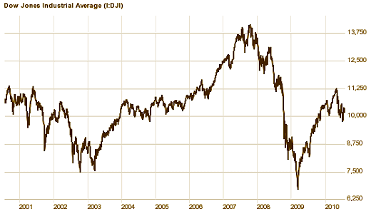
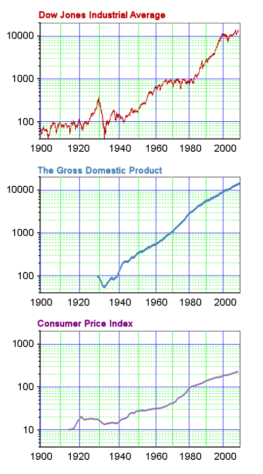
The Dow Jones Average is seen as a minute to minute index of our economy by many Americans – the pulse of our well·being. Yet while we’ve been on something of a wild ride in the last few years, the Dow Jones Average today is almost exactly what it was ten years ago. But what does that mean?
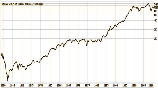
If we look at the values over the period from the Great Depression to the present [logarithmic scale], the "flatness" of the last decade is apparent. Following a ten·fold escalation in the twenty years before, it appears we’ve reached some kind of plateau in the last decade. Even with the dot·com bubble, the housing bubble, and the oil bubble – the DOW seems to be stubbornly hovering at around 10,000 like that’s where it belongs. But what does that mean?
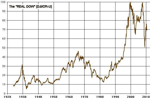
I’m not the only graph·nut around. People love to pore over the DOW graphs to unlock her secrets. One way to look at it is to correct the DOW for the CPI-U [the Consumer Price Index] [an index published by the government of the current cost of a standard package of goods]. The CPI-U is referred to as "Inflation." So the "Real DOW" is the DOW/CPI-U, the DOW presumably corrected for inflation. Looking at the "Real DOW," these flat periods [1965-1982, 2000-2010] appear as times of loss – the value of the Stock Market is falling in relation to the value of our currency in the market·place. But what does that mean?
Earlier this year, I ran across a different approach to "correcting" the DOW for inflation. This group of economists corrected the DOW by dividing it by the GDP [the Gross Domestic Product] [an index published by the government of the overall productivity of the economy]. That makes more sense to me. If the DOW tracks the worth of our economy, it should parallel the productivity of our economy rather than buying·power in the market·place.
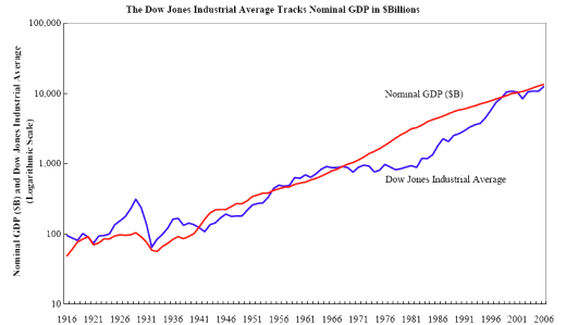
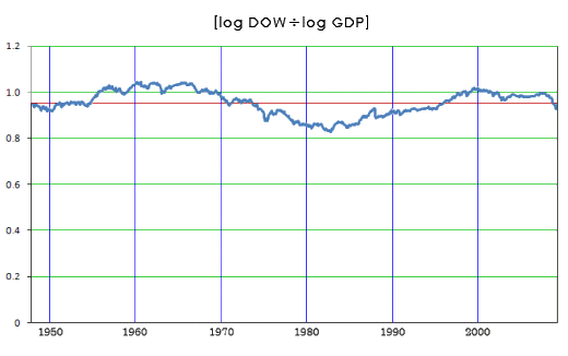
While this version doesn’t explain why things were level from 1965-1982, it does make some sense out of the period from 1983-2000: a correction. The hypothesis that the DOW Industrial Average should parallel the GDP – the industrial yield – seems sensible. It takes some of the "But what does that mean?" out of the equation.
I wondered what it would look like if one tested the parallel·ness of these lines [DOW and GDP] by dividing them out [log·DOW/log·GDP]. I thought the way it came out [below] was pretty interesting. It reduces our economy to small oscillations around a level straight line – the value of our economy [DOW] is mostly a function of the productivity of our economy [GDP]. I find that comforting – mathematically and otherwise.
Fortunes are made and lost on the minute to minute fluctuations of the Stock Market [DOW]. Administrations come and go based on the year to year fluctuations of the Stock Market [DOW]. Eras are categorized by the decade long fluctuations of the Stock Market [DOW] [the Roaring Twenties, the Depression, the 90’s, etc.]. But in the long haul, it’s like that song, "Old man river, he just keeps rolling along." But what does that mean?
During my adult life, an industry has grown geometrically – the Financial Services Industry: Stock Brokers, Financial Planners, Fund Managers, Bankers of all flavors, Hedge Funds. In my earlier life, people had checking accounts and savings accounts. Stock ownership wasn’t a major middle·class thing. It was something rich people did. But all that changed in the early 1980’s, and the middle·class became as obsessed with the Stock Market as the tycoons of an earlier era. There was a rapid proliferation of people to handle the influx of investors. Retirement plans moved from Banks to the Stock Market pouring capital into the economy. People began to talk about money like it was in the plant family – something that "grew." The concept of "making money" changed from being something that referred to employment to something that referred to investments – eg "making money on the Stock Market."
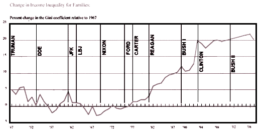
One might think this period of financial involvement of the middle·class would be a prosperous time. It hasn’t been. Only the top 5% of wage·earners have seen incomes rise. For the rest of us, wages have been flat. And the GINI Index, a measure of wealth inequity, has escalated remarkably during the same period [four·fold increase] – the rich have gotten much richer. But what does that mean?
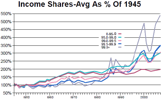
[data through 2007 – my adaptation from Open Left]
The foray of the middle·class into the world of what used to be called financial speculation during the last thirty years has paradoxically been productive for the very rich, not the masses in the middle who made the jump. And the boom in the Market that was so alluring may well turn out to have been illusory, simply the oscillations around the mean [a statistical artifact] or a temporal phenomenon based on economic manipulation that has reached its predictable limits. Whatever it has been, it‘s most likely a passing thing. People seem to be longing for it to come back not realizing that it wasn’t particularly good for them after all.
Sorry, the comment form is closed at this time.