The oldest map of the world shows Babylon [the rectangle] and its surrounding countries.
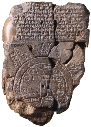
British Museum 6th Century BC
Hecataeus’ work, especially the Genealogiai, shows a marked scepticism of oral history, opening with "Hecataeus of Miletus thus speaks: I write what I deem true; for the stories of the Greeks are manifold and seem to me ridiculous."
You’ve got to admire a guy like
Hecataeus of Miletus. This is a reproduction of a map of the world he drew centered in Miletus that only contained what he knew from his own wanderings:
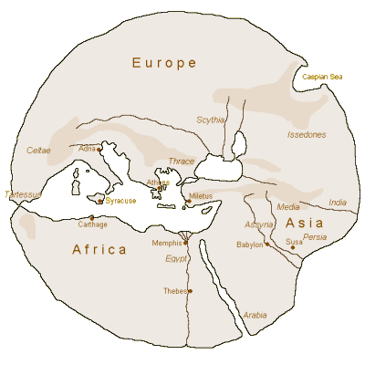
Hecataeus of Miletus – 500 BC
Ptolemy added calculations, though his data was often defective. His map extended the edges of the known world. The further the distance from his home base in Alexandria, the greater the errors:
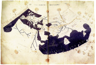
Ptolemy – 150 AD
al Idrisi, a descendant of Mohammed, added a lot detail from the information gathered by the Arab inland and coastal traders [but not much geographic accuracy].
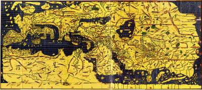
al Idrisi – 1154 AD
With the coming of ships capable of long voyages and more advanced navigational tools, maps such as this one by
Martellus began to more accurately portray the Old World [literally on the eve of Columbus’ voyage]:
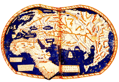
Martellus – 1490 AD
Within only a few years, maps like this one by
Waldseemüller began to add the discoveries by Columbus, Cabot, Marco Polo. Note the Latitude/Longitude grid. This map was the first to add the label "America" to the New World:
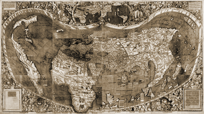
Waldseemüller – 1507 AD
Within a short time,
Diogo Ribero created the first truly scientific world map using empiric latitudes. Note that the western extent of the Americas is unknown and left blank:
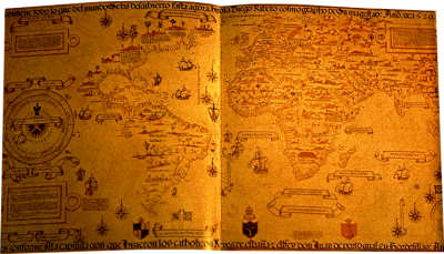
Ribero – 1529 AD
But within 40 years, the known world was finally "known," shown here in
Gerardus Mercator‘s world map made with the his new cylindrical projection [still in use as the "Mercatorial Projection"]:
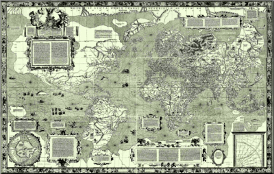
Mercator – 1569 AD
 And so the maps just kept getting more accurate as technology and exploration advanced. But, as anyone who was near a television set in 1968 would be glad to tell you, no map ever equaled that first glimpse of the real thing from space as Apollo 8 went around the Moon and sent the first photos of the "earthrise." 1968 was a year of assassinations and political upheaval in the US, but those pictures ended the year with a much-needed ray of hope.
 These are some of the great maps along the two thousand plus year road to an accurate rendition of our world [Wikipedia]. Some of the advances were technological – the Astrolabe, Quadrant, Sextant, ship and sail design, accurate time-pieces. Others were conceptual – Latitude, Longitude, a spherical earth, cartographic advances. Many were commercial – funded exploration in search for gold, trade routes, conquest. At times there was no progress for centuries. At other times, each new map improved over the last.
I wrote this some time back. At the time, I was thinking about the frustration with the lack of expected discoveries in neuroscience given all of the new technologies. I think I was responding to the APA’s DSM-5 Task Force and the NIMH’s RDoC trying everything in their power to speed up science by having conferences, committee meetings, redoing classifications, and wringing their hands. I was actually wondering if the kings and merchants who commissioned these ancient maps were as impatient as their modern counterparts and had similar councils. It sat in the unpublished posts bin for a long time, because I couldn’t think of any commentary. I ran across it today, and thought I’d post it for no reason other than the maps are interesting [and maybe to say that science often has its own pace]…


Very à propos, Dr. Mickey. We might add that not only does science have its own pace but that pace can be retarded by managers who take it upon themselves to call the shots on objectives, on programs, and on funding priorities. To name just one example, NIMH under the leadership of Steven Hyman and then Thomas Insel committed $35 million for STAR*D – which produced nothing of substance, having been an imprudent conceit to begin with – and who knows how much more for derivative genetic studies that are doomed to fail because the primary data from STAR*D do not measure up? And don’t get me started on about the translational science centers! It is fair to say that none of those in NIMH responsible for these fiascos and now for RDoC succeeded as researchers in the model they are now promoting. They talk the talk but they have not walked the walk. Original science is too important to be left to the bureaucrats, mesmerized by their 5-year plans and their Decade of the Brain.
The Perry-Castañeda Library at the University of Texas, has an enormous collection of maps on-line.
http://www.lib.utexas.edu/maps/
As expected, UT Southwestern is leading the way in disseminating NIMH’s roadmap…
http://cmetracker.net/UTSW/Catalog
Dr. Nardo,
I too have good memories of the Apollo 8 Mission.
Especially Christmas Eve, 1968, when the space crew: Frank Borman, Jim Lovell and Bill Anders sent a blessing to all of us “on the good earth.” –
http://www.youtube.com/watch?v=XEmn0uaQCYc
That was a very special broadcast.
Duane
And in the Middle Ages maps were often intentionally distorted (details/facts left out and other aspects greatly exaggerated) to impress the viewer and the person (maybe the King) commissioning it. There are numerous fascinating examples of this. This seems to takes us back to RCTs and the like.
One thing that I think is often problematic in social engineering is conflating the map with the territory. A psychiatrist once said that I appeared not to “have a compass”; when what she meant was that I wasn’t using a map that made sense to her.
There is implicit bias toward white, Christian, and middle-class males in nearly every Western institution. Most models of “normalcy” are based on middle-class values and the management theories of business schools.
The “map” that “neuropsychiatrists” are trying to build right now, looks an awful lot like that stone tablet up there. Soon enough, I suspect they’ll discover that boundaries in brains don’t work the way they expect them to, that their sample sizes are ridiculously small, and that their categories are not much based on anatomy.
a friend sent me your map musing and i find it interesting that i just put a new quote on my email signature:
The greatest obstacle to discovering the shape of the earth, the continents, and the oceans was not ignorance but the illusion of knowledge. -Daniel J. Boorstin, historian, professor, attor