Some more statistical fluff. I don’t know the story of how the meta-analyses [study of studies] came to be and how the methodology was developed, but I know about it from the Cochrane Collaborations. Wherever and however aside, it’s pretty spectacular from where I sit. Both the metrics used and the way they’re displayed has become standardized, so a collection of many different studies can be compared and quickly understood visually. There are a lot of different techniques involved in these articles, and I’ll only cover some of the more obvious ones.. If you’re not a numbers type or you know your statistics, just skip this post. But if you want to become an amateur vetter and meta-analysis junkie, read on. After a few more posts, there will be a summary and a guide to the Internet calculators to do various aspects of the math involved. These days, meta-analyses are something a critical reader needs to know about.
In
in the land of sometimes[1]… and
in the land of sometimes[2]…, I looked at some of the statistical tests used to calculate the Probabilities and Effect Sizes of
continuous and
categorical variables. In this installment, I want to discuss one basic format used in the meta-analyses that attempt to collate and compare multiple Clinical Trials focused on the same drug. Obviously, comparing p values wouldn’t be of much comparatave use. Probabilities are treated as yes/no statistics determined by the prespecified alpha level [eg p
< 0.05], and in spite of the temptation to say things like "very significant" or "barely made significance" based on the numeric p value, such attempts at quantification are unjustified. The obvious candidate for quantitative comparisons among studies would be the Effect Sizes. That would be comparing the strengths of some given effect across studies – which is exactly what we want to do.
So let’s first look at an example using a continuous variable comparing two different groups. The information we started with is in the left column and the values we calculated to derive the Effect Size [Cohen’s d] are in the right column [see in the land of sometimes[1]…]:
|
Group Statistics
|
|
Effect Size Calculations
|
| subjects |
|
n1, n2 |
Cohen’s d |
|
d = (μ1 – μ2) ÷ σ |
| means |
μ1, μ2 |
pooled std dev |
 |
| std devs |
σ1, σ2 |
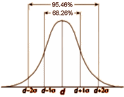 Remember that Cohen’s d is also known as the Standardized Mean Difference. So what we have in the right hand column is actually the distribution of the Effect Size. All we have to do now is realize that what we’ve been calling the Pooled Standard Deviation is actually the standard deviation of Cohen’s d, and that we can use it to calculate the 95% Confidence Limits using these simple formulas [either take that last part on faith or read it over several times until it makes sense]:
lower limit = d – 1.96 × σ
upper limit = d + 1.96 × σ
So now, instead of showing Cohen’s d as a frequency distribution like the upper right, we can display it more simply:

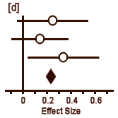 In [a], the circle represents Cohen’s d and the lines define the 95% Confidence Interval. So with a glance, you can see the Effect Size, the "spread," and whether it’s significant [the Confidence Interval line doesn’t touch or cross zero – the null hypothesis]. The example in [b] is not significant. But what I consider the brilliant part is in [c]. If you have three different studies of a drug versus placebo, you can display them together and again, in a glance, see what’s up with all of them – the essence of meta-analysis. And there’s even more. By weighting these studies eg based on sample sizes, one can display a summary Effect Size that represents the whole collection of studies [d]. In the case of using sample sizes:
d = (n1 × d1 + n2 × d2 + n3 × d3) ÷ (n1 + n2 + n3)
 We’ve gotten so used to these forest plots that it’s easy to forget how much they’ve helped us see the big picture in one simple graphic. At least for me, this is a testimony to the adage, "a picture’s worth a thousand words." There’s something of a monotony in these clinical trials, so the information needed for this kind of comparison is almost always available. And, by the way, look at the Cochrane Collaboration logo.
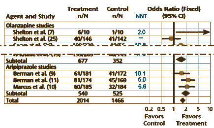
Well, what about the categorical variables? One can almost say "ditto." They use the Effect Size as well, in this case the Odds Ratio. The calculation of the 95% Confidence Intervals is less intuitive, so most mortals like me would be best advised to use one of the Internet calculators [here, here, and here]. The vertical line representing the null hypothesis is at 1 instead of 0. And there’s something else different: the 95% Confidence Interval lines are asymmetric, so authors usually use a logarithmic scale to display the values symmetrically. Look at the Odds Ratio scale on the meta-analysis of Atypical Antipsychotic augmentation I reported on earlier [creative funding III & some other things…]:
The land of sometimes can be like Never-Land, or Narnia, or the Land of Oz. Lots of peculiar things can and do happen in fantasy realms where not everyone knows the rules, sometimes just out of sight. Unlike the mathematics of Algebra, Calculus, Topology, etc, there’s a lot of room to wiggle and wiggle they do. Over the time I’ve been looking at these Clinical Trials, I’ve become increasingly rigid in making sure all the rules have been followed. That’s the reason for my little amateurish statistical interludes like this. I figure the more savvy the readership, the less likely it will be for the spinners of yarns to continue to have their way with us. Paradoxically, I cringe at the phrase evidence based medicine, or for that matter evidence-based-anything-else. It’s an acquired cringe, but I’ve noticed that the people who use the phrase frequently are likely using even the term itself to spin something. It’s kind of a shame. Statistical mathematics can be really elegant at times and answer questions that couldn’t be asked without it. I think of this simple methodology used in meta-analyses as an example of that…
 Remember that Cohen’s d is also known as the Standardized Mean Difference. So what we have in the right hand column is actually the distribution of the Effect Size. All we have to do now is realize that what we’ve been calling the Pooled Standard Deviation is actually the standard deviation of Cohen’s d, and that we can use it to calculate the 95% Confidence Limits using these simple formulas [either take that last part on faith or read it over several times until it makes sense]:
 In [a], the circle represents Cohen’s d and the lines define the 95% Confidence Interval. So with a glance, you can see the Effect Size, the "spread," and whether it’s significant [the Confidence Interval line doesn’t touch or cross zero – the null hypothesis]. The example in [b] is not significant. But what I consider the brilliant part is in [c]. If you have three different studies of a drug versus placebo, you can display them together and again, in a glance, see what’s up with all of them – the essence of meta-analysis. And there’s even more. By weighting these studies eg based on sample sizes, one can display a summary Effect Size that represents the whole collection of studies [d]. In the case of using sample sizes:
 We’ve gotten so used to these forest plots that it’s easy to forget how much they’ve helped us see the big picture in one simple graphic. At least for me, this is a testimony to the adage, "a picture’s worth a thousand words." There’s something of a monotony in these clinical trials, so the information needed for this kind of comparison is almost always available. And, by the way, look at the Cochrane Collaboration logo.
Science based medicine, that is all.